
Growing Minds
Project: Triptych Poster
For this project, we are required to propose a visual thesis that reflects a theme or topic connected to our personal interests or social. The core of the project is to create a cohesive series of three designs that work together to deliver a clear and impactful message. These designs can take the form of posters, campaigns, or any other visual deliverables best suited to express the theme.
Sketches
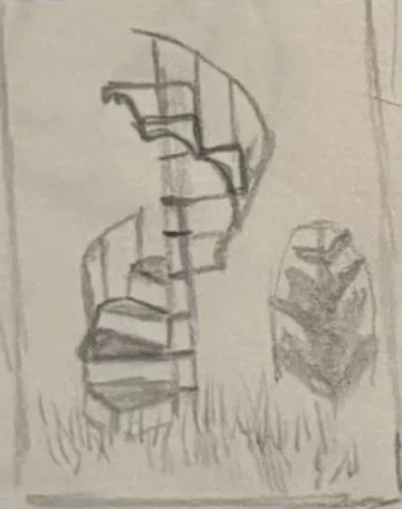
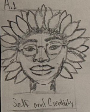
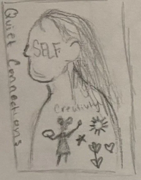
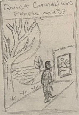
I began my visual thesis as a three-part series exploring “quiet connections,” inspired by subtle emotion, memory, and reflection. But as the project evolved, the concept no longer felt effective, and I ultimately decided to scrap it and take a new direction.
Final

Typography
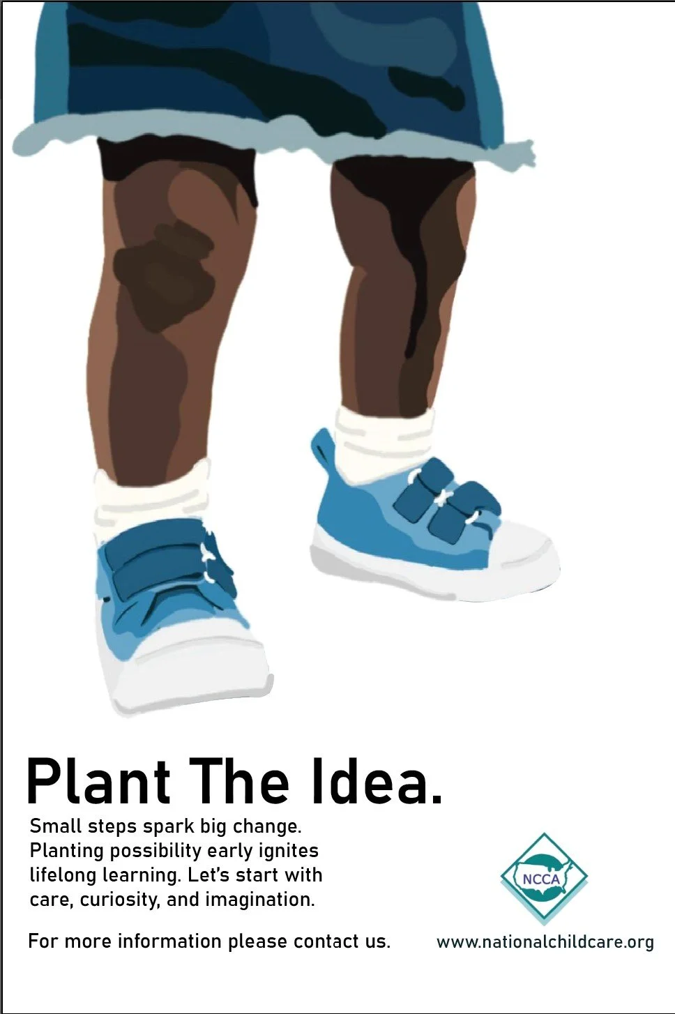
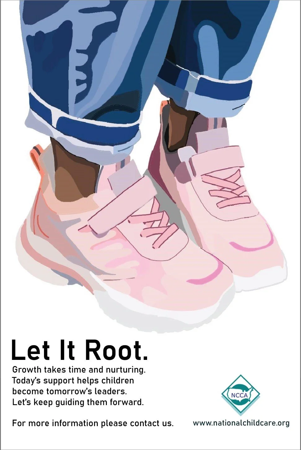
I chose Bahnschrift SemiBold for the heading and Bahnschrift Regular for the body to reflect the clarity and structure of the growth process. The clean, modern feel of the typeface aligns with the natural, intentional theme of the posters. Using two weights helps create a clear visual hierarchy while maintaining a cohesive design.

Digital Draft
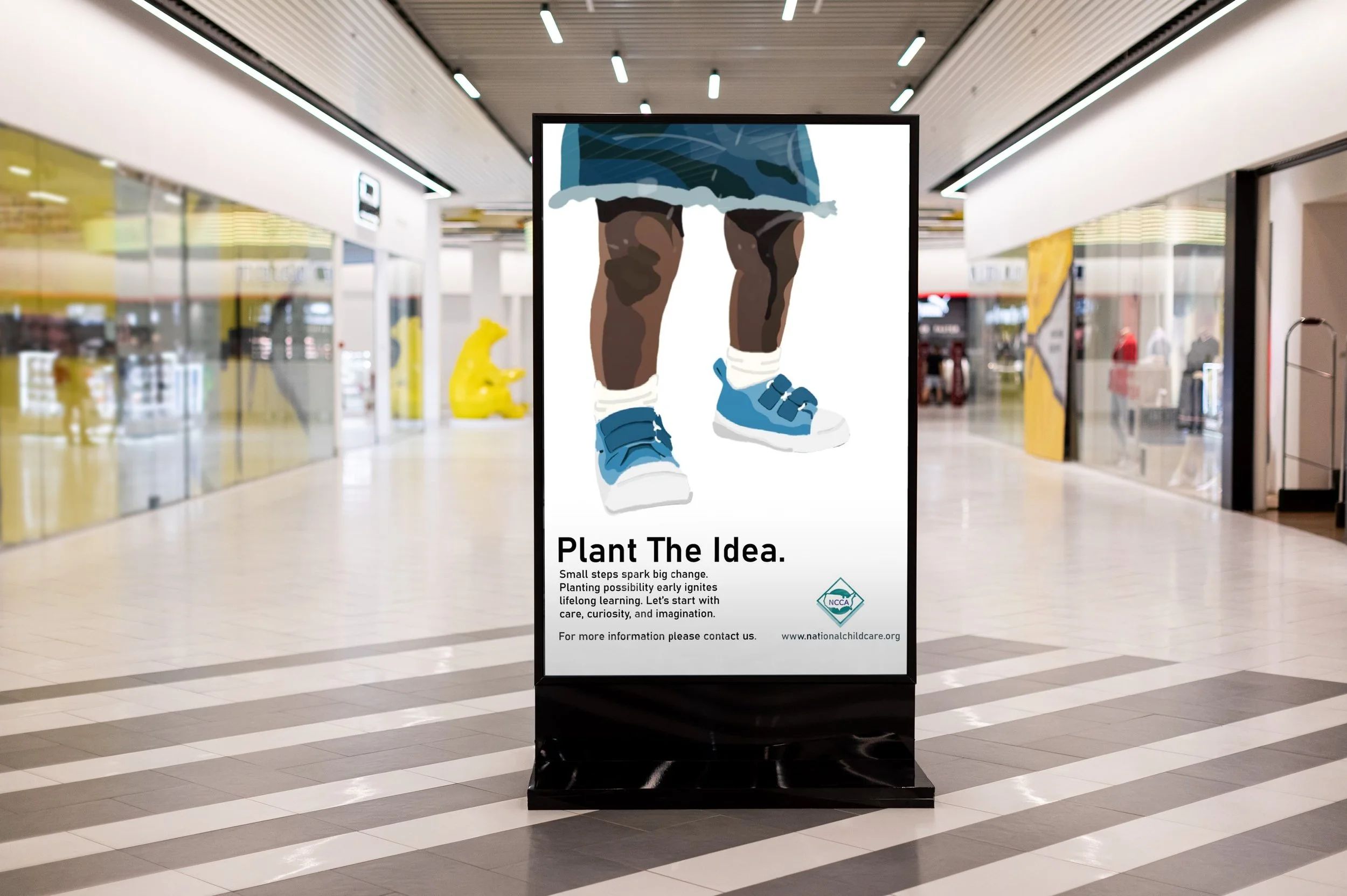
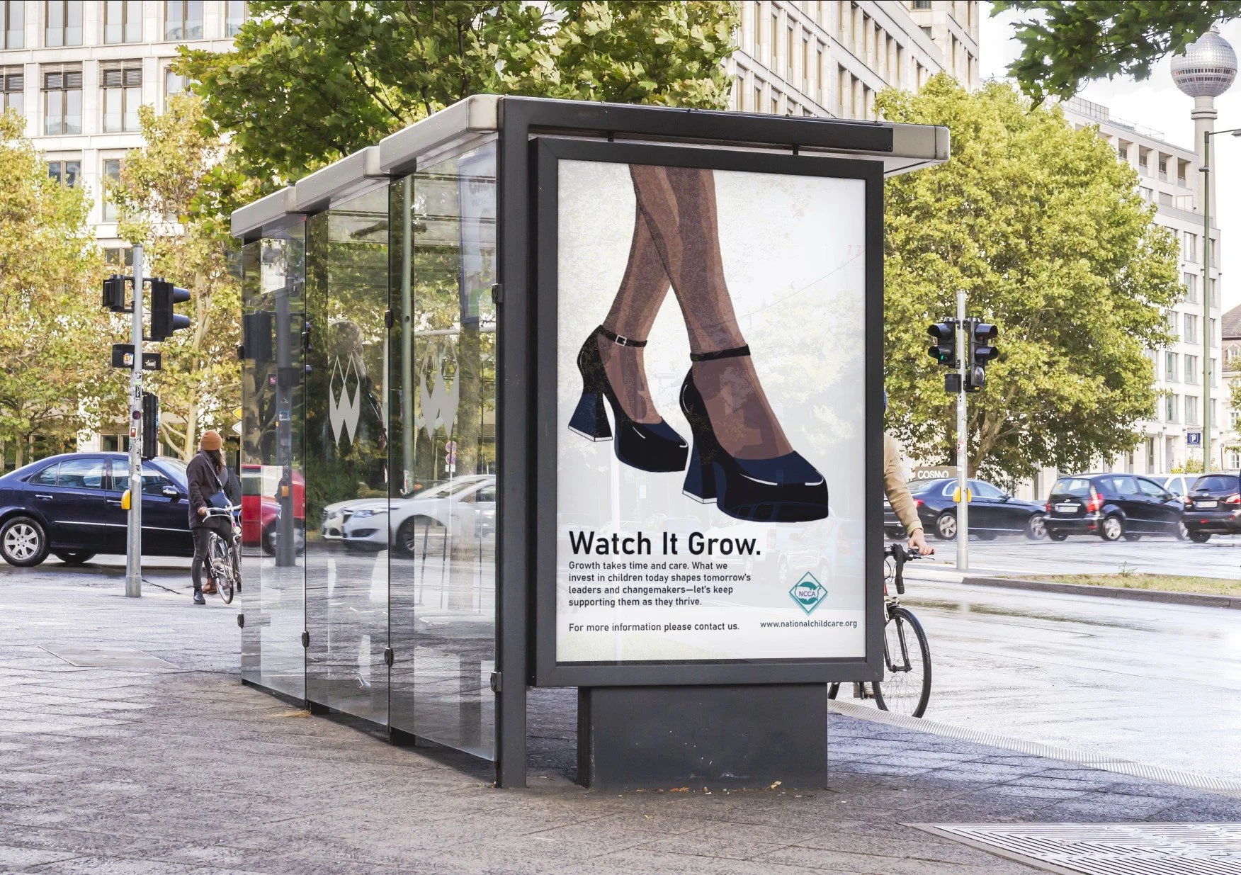
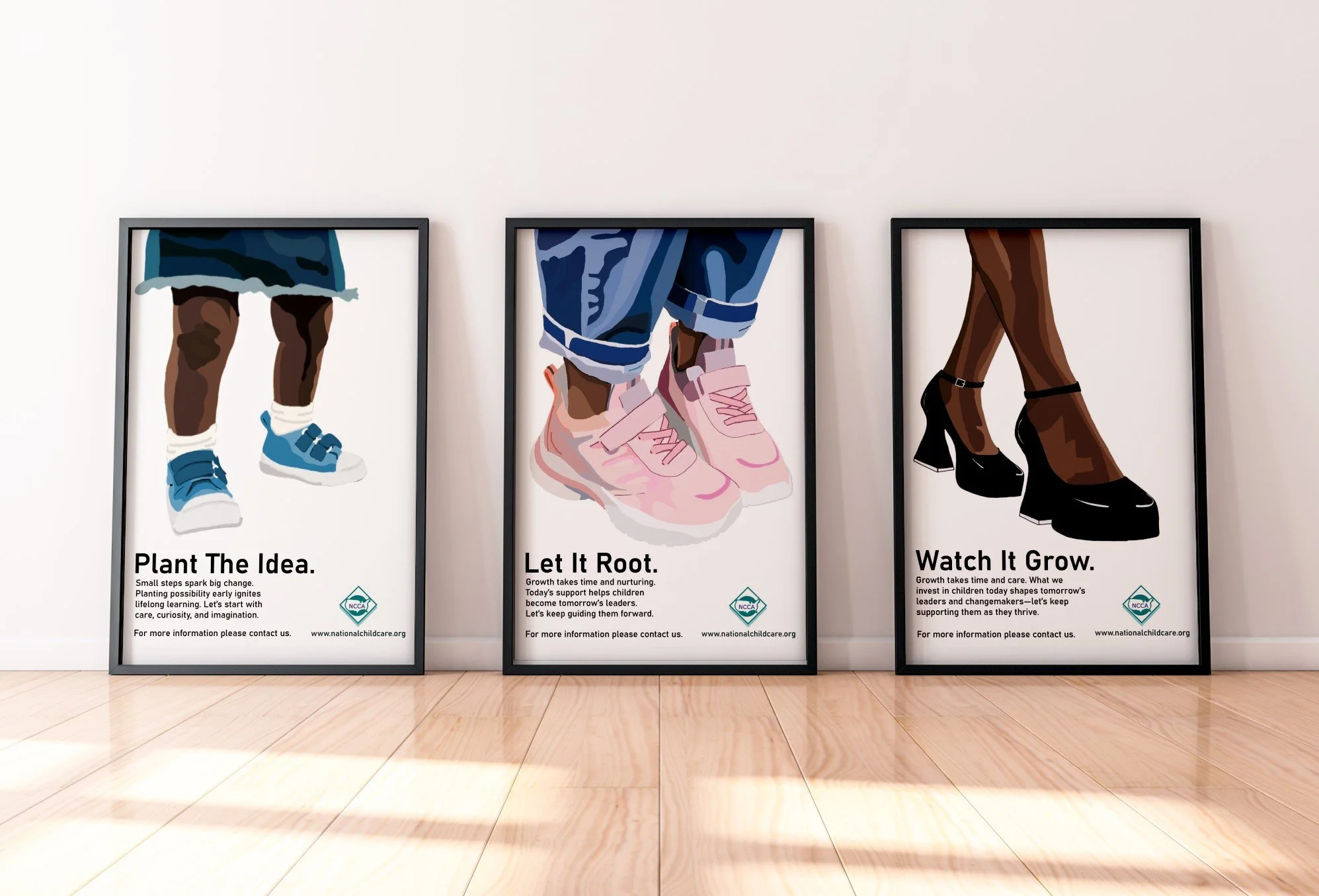
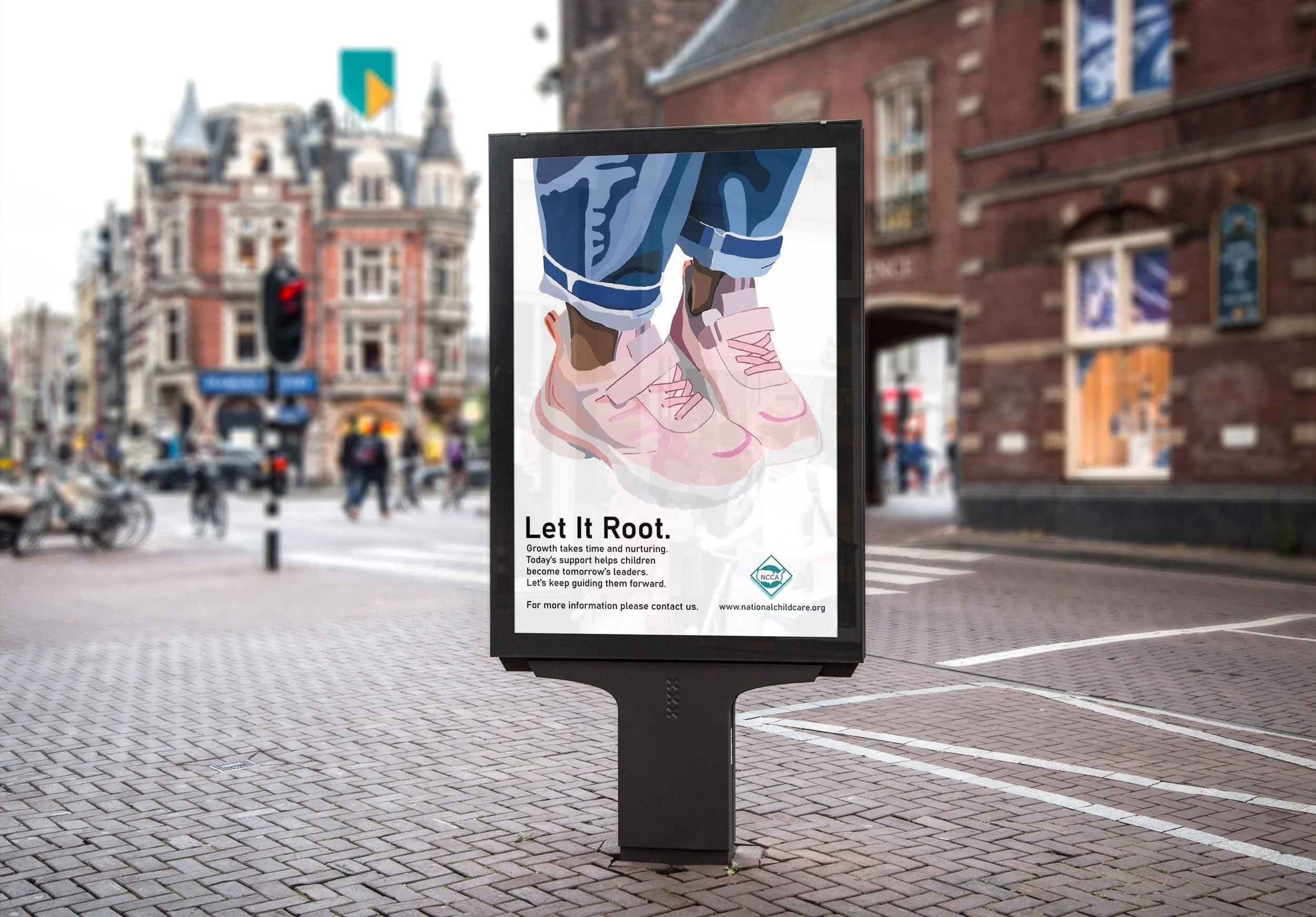
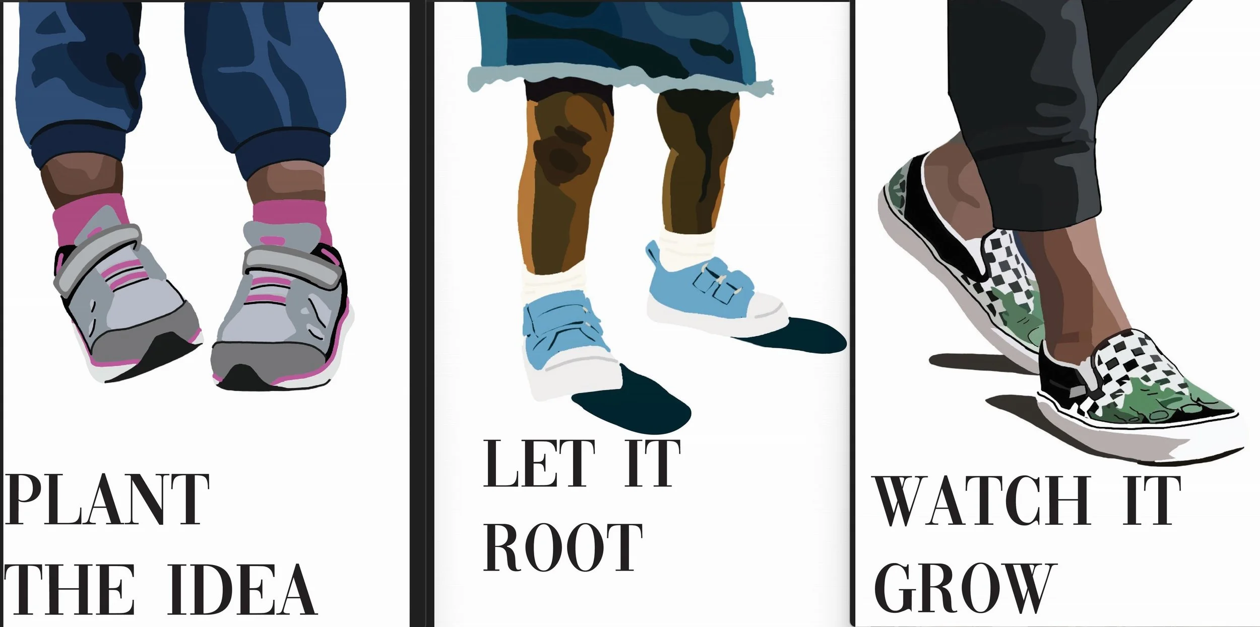
This visual thesis uses nature as a metaphor to explore nurturing children to their full potential. The three-poster series—*Plant the Idea*, *Let it Root*, *Watch it Grow*—represents curiosity, foundation, and growth. Together, they highlight the care and patience needed to help kids thrive.In this draft, the last poster feels more like a teen, but it should represent an adult to complete the baby–child–adult progression. I also plan to reduce the type size so it doesn’t overpower the visuals and better supports the overall design and a more cohesive narrative across the series.
To fix this, I created a new illustration to make it feel more grown-up by adding heels. For the type, I went with Bahnschrift, which is a clearer font but still bold enough to make a strong visual impact.

Evironmental Contact