John Igo Branch Redesign
Project: Public Spaces
In this project, I explored how design can address real-world constraints by tackling a common public library dilemma: how to engage a diverse audience and encourage community use in an increasingly digital world. Libraries are vital yet often face limited funding, outdated visuals, and misconceptions about their relevance. My challenge was to reimagine the library's visual communication to invite curiosity, reflect inclusivity, and highlight its role as a vibrant, evolving space. Through research into community-centered design, accessibility, and modern public branding, I developed a solution that brings clarity, warmth, and renewed purpose to the library experience.
Original Logo
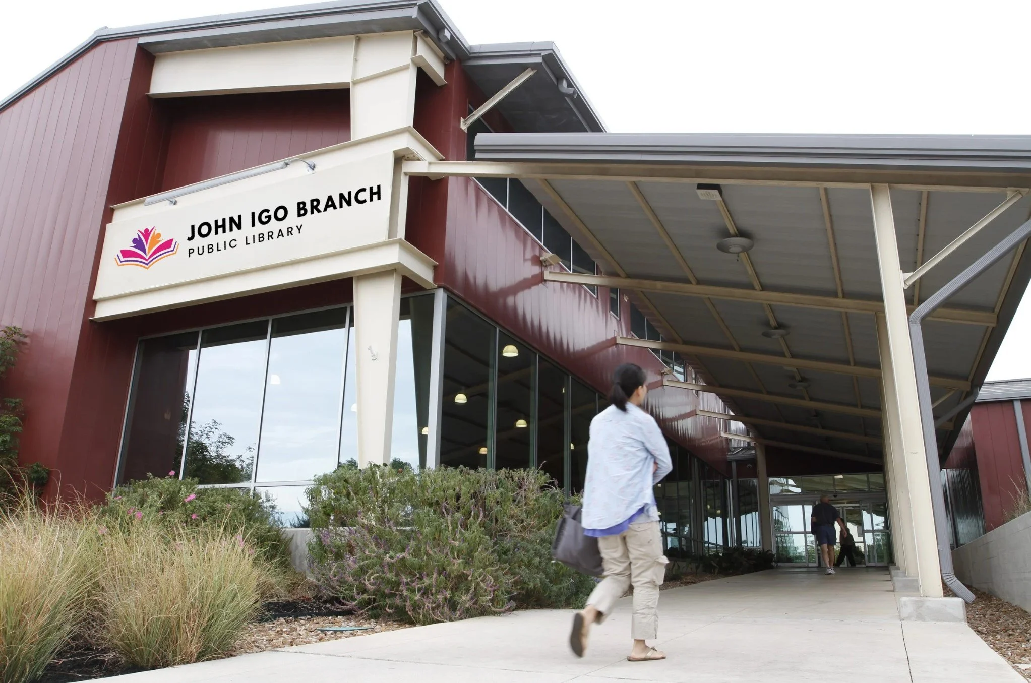
The IGO library does not have a set logo. The libraries around town are all connected in website and logo

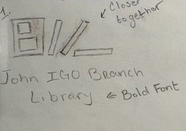
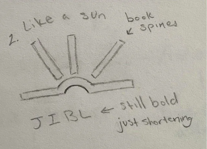
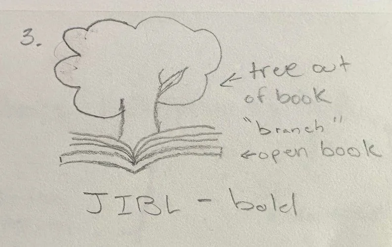
Sketches
My sketches include lines similar to the original logo to maintain a sense of visual continuity and honor the library’s existing identity. These lines act as a subtle nod to the past while allowing room for a fresh interpretation. They can symbolize books on a shelf, pages, or pathways—reinforcing ideas of knowledge, movement, and discovery. Including them helps the updated logo feel familiar to returning visitors while still looking modern and intentional. Visually, the lines also help balance the bold font choices and structure the overall layout, keeping the design cohesive and grounded.
Color
I wanted to include the original colors, orange, pink, and purple, in the new logo to maintain continuity and honor what was already familiar to the community. These colors already carry meaning and recognition, and they reflect the vibrant, welcoming spirit of the library. They evoke creativity, warmth, and imagination—all things a library should inspire. By using them in a fresh, updated way, I’m connecting the past to the future.
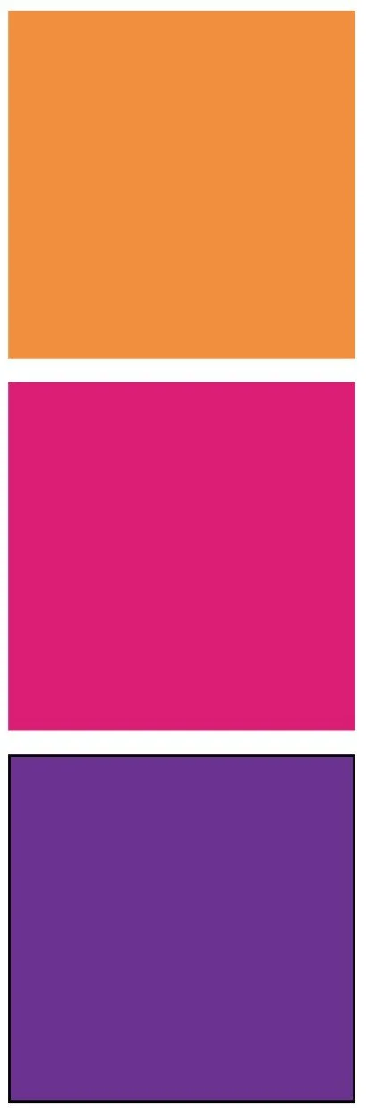
#F18F3F
RGB 241, 143, 63
CMYK 0, 41, 74, 5
#DA1E75
RGB 218, 30, 0
CMYK 0, 86, 46, 15
#6B338F
RGB 107, 51, 143
CMYK 25, 64, 0, 44
Typography
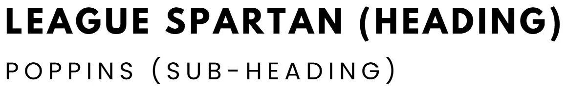
I chose League Spartan for the headings because it’s bold, modern, and clean—perfect for making a strong first impression. Its geometric structure gives the design a contemporary feel while still being easy to read at a glance. For the subheadings, I went with Poppins because it pairs well with Spartan but offers a softer, more approachable tone. The rounded letterforms balance out the boldness of the heading, creating a friendly and accessible look that fits the inclusive spirit of a community library.
Final Logo
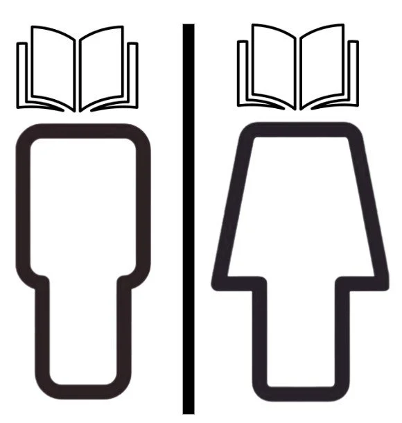
I used the original colors—orange, pink, and purple—to create an open book made of three layered pages, each representing one of the main colors. These layers not only add depth but also symbolize the vibrant foundation of the library. Emerging from the book are reaching figures, also in the same colors, representing people engaging with knowledge, community, and imagination. This visual connects the library’s mission to uplift and inspire with its history and identity, using color to tie everything together in a unified, energetic way.

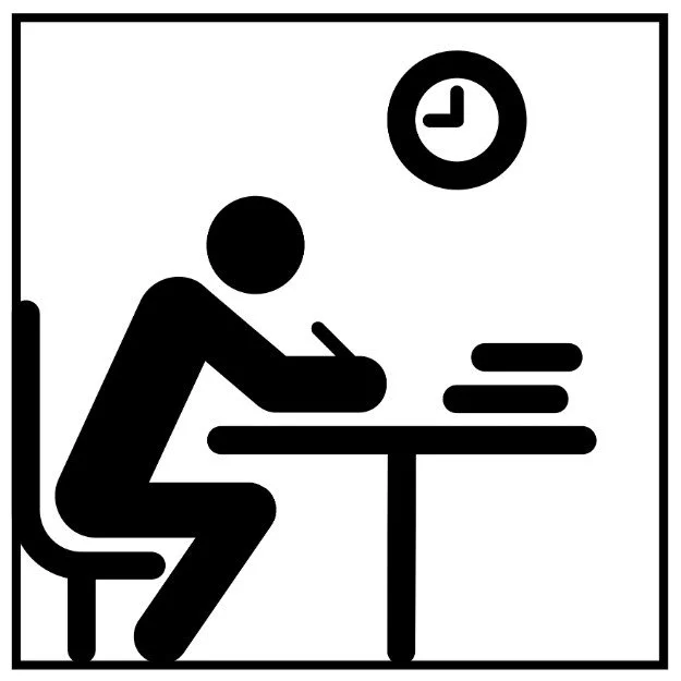
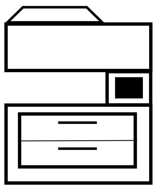
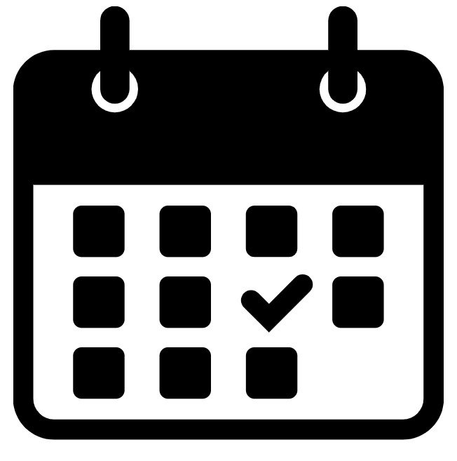
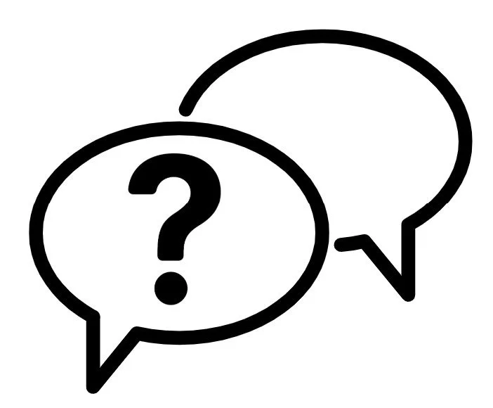
Pictograms