Payless ShoeSource Rebrand
Project: Brand Identity
For this project, I rebranded a defunct company by envisioning how it could be revived with a modern, relevant identity. The goal was to honor its original values while updating the logo, color palette, and tone to appeal to today’s audience. This rebrand breathes new life into the company, positioning it for the contemporary market while respecting its history, demonstrating how thoughtful design can revitalize and recontextualize a brand even after it has disappeared.
Old Logo

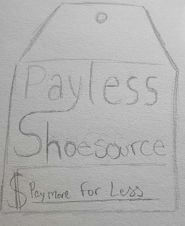
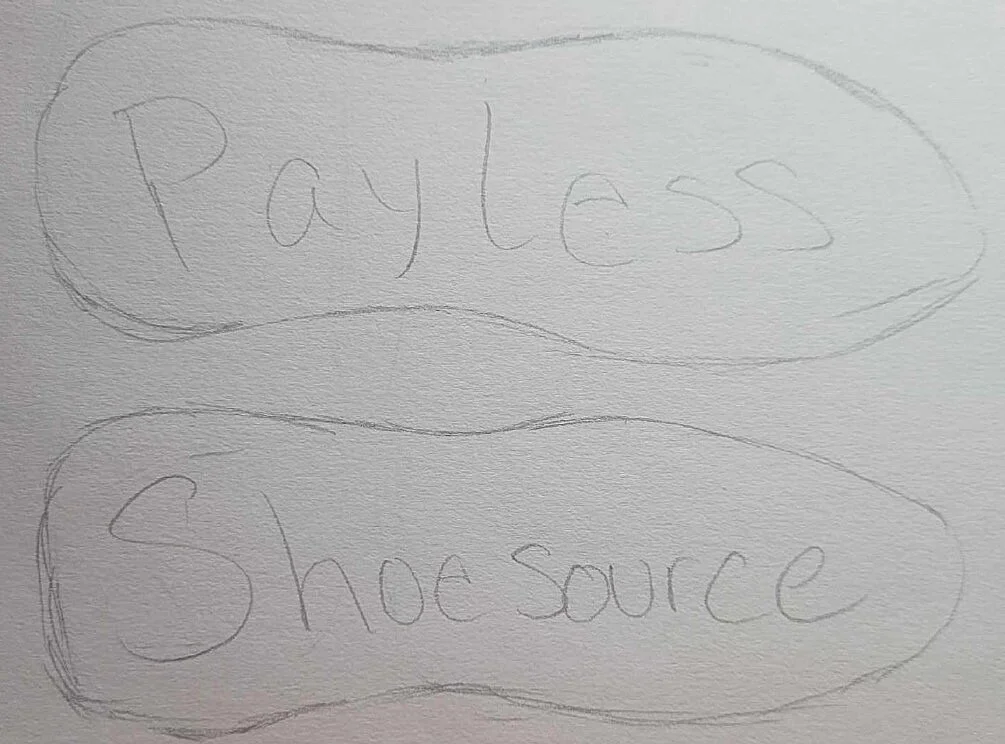
Sketches
I sketched new Payless logos inspired by a clearance tag, the soles of shoes, and shoelace lettering to visually connect the brand to affordability and footwear in a playful way. Each concept highlights a different aspect of what Payless offers; great deals, shoe-focused products, and a fun, approachable identity. These sketches helped me explore how the logo could feel more memorable to customers.

Color
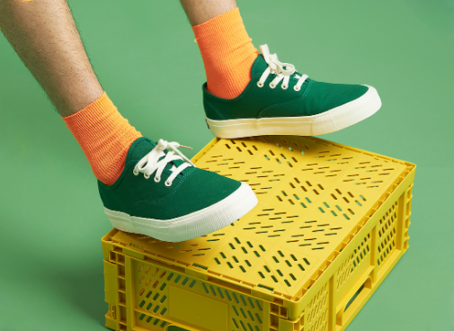
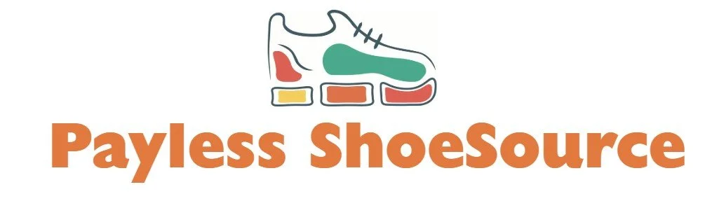
The vibrant palette—orange, coral, yellow, blue, and teal—adds energy, warmth, and a sense of fun. These colors work together to make the brand feel more lively and joyful, reinforcing the idea that Payless is a place where finding a great deal is both exciting and affordable.

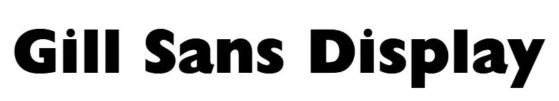
Typography
I chose Gill Sans Display for its bold, clean letterforms and friendly curves. It brings a sense of confidence and warmth to the Payless logo, striking a balance between classic and modern. This typeface adds a playful but polished feel that helps reintroduce the brand with approachability and style.
New Logo
Environmental Contacts
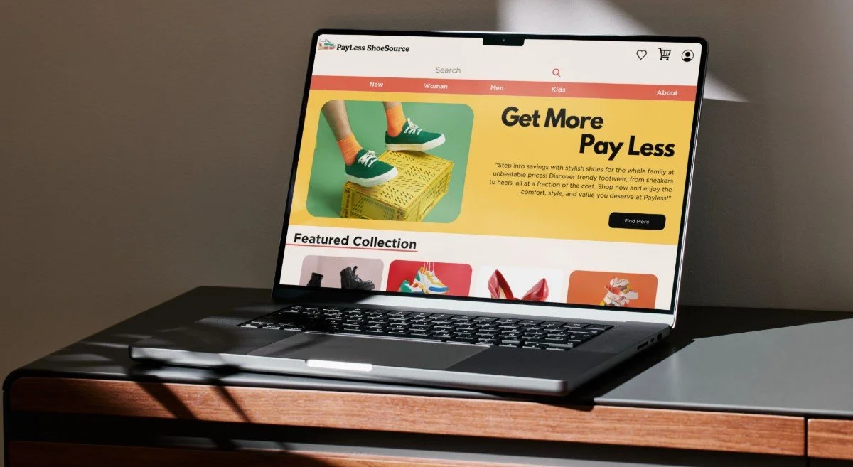
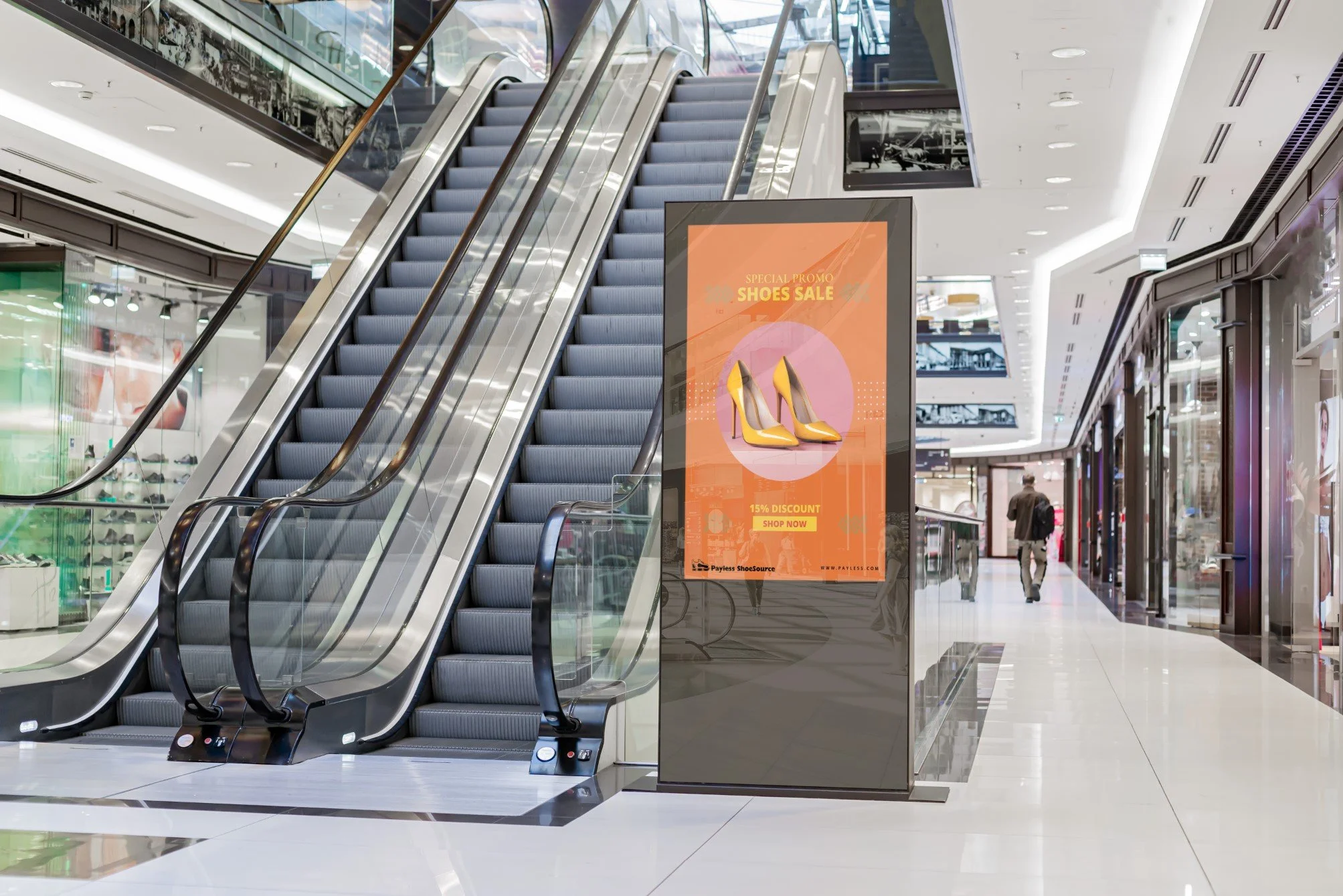
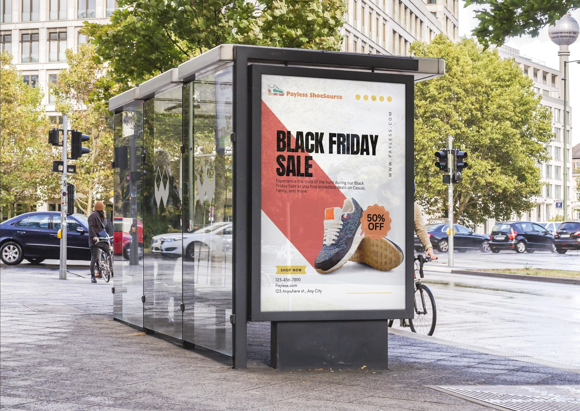
I made banner ads for Payless Shoesource to help bring attention to the brand’s return and fresh new look. They’re a quick, effective way to share deals, highlight new styles, and reconnect with shoppers online—reminding people that Payless is back, stylish, and still affordable.