Maruchan Redesign
Project: Classic Package Redesign
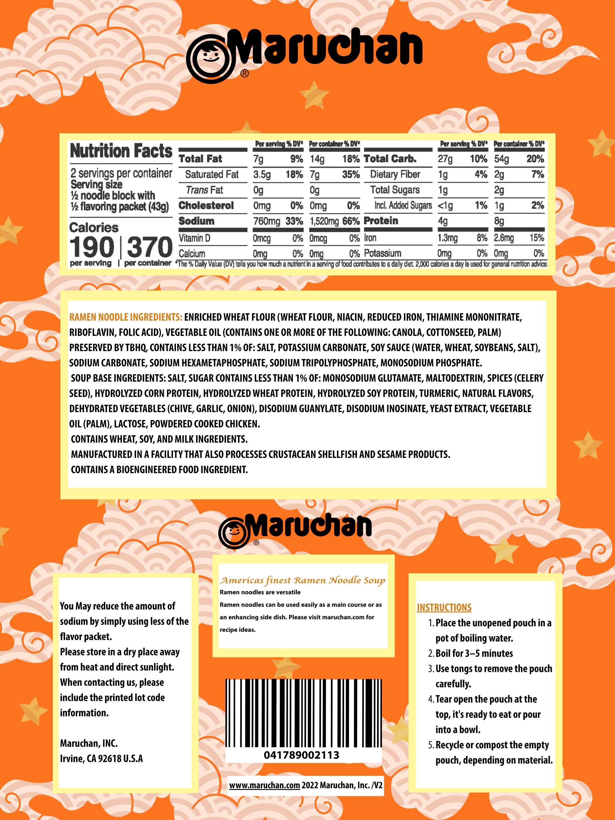
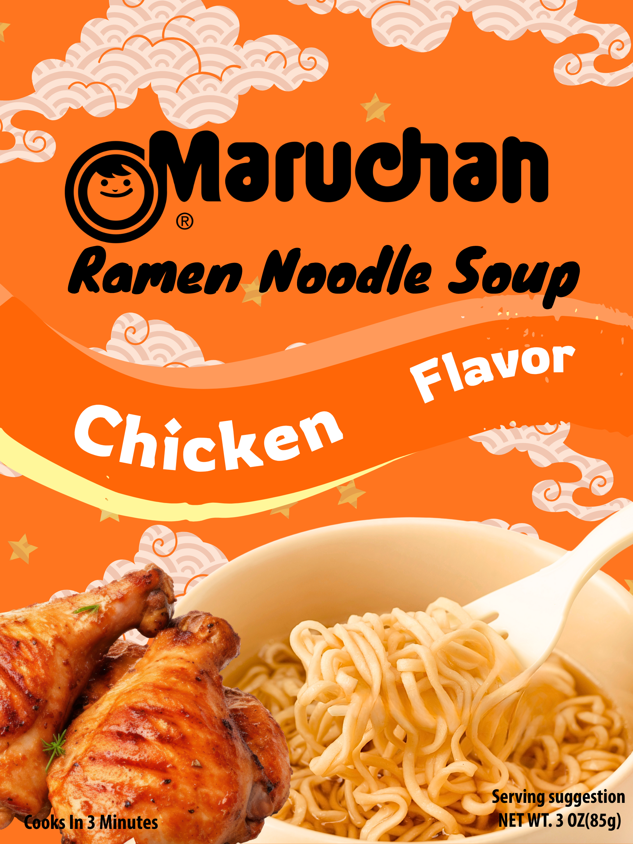
For this project, I was tasked with selecting an existing product and redesigning it to be more sustainable, focusing on materials, packaging utility, and reducing its shipping carbon footprint. My goal was to improve not just the physical design, but also the brand’s presence in the market through impactful graphics, thoughtful typography, and clear, informative copy.
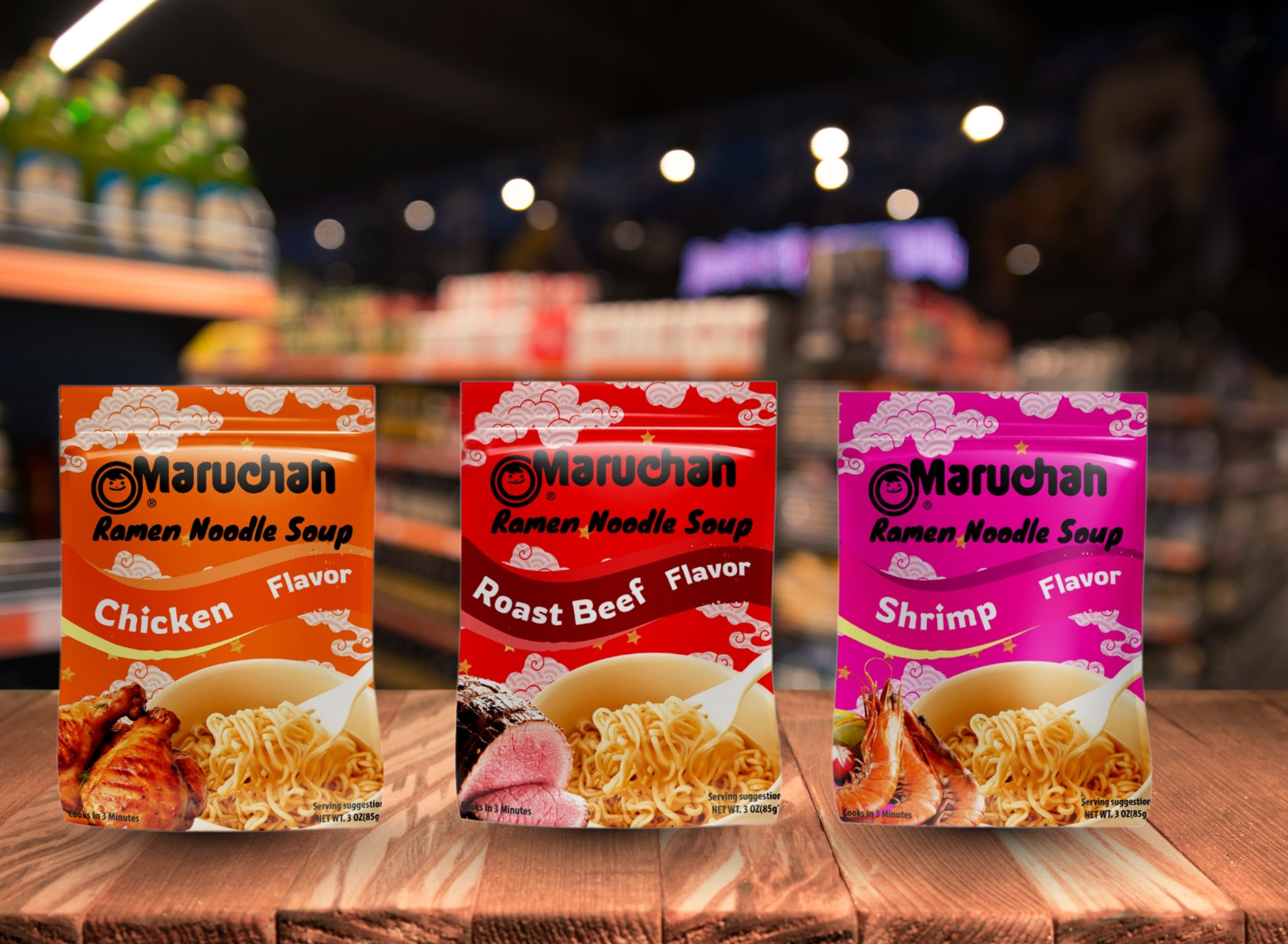
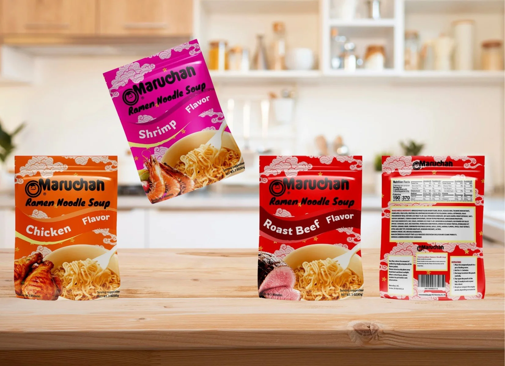
I explored designs for a cube, mason jar, cylinder, and pouch for my instant ramen packaging to test different forms that balance function, sustainability, and shelf appeal. Each shape offers a unique experience: like the mason jar for reusability, the pouch for flexibility and portability, and the cube or cylinder for stackability.
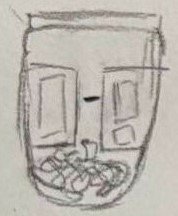
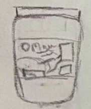
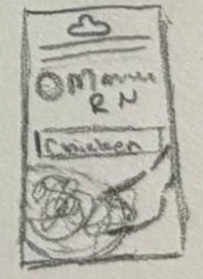
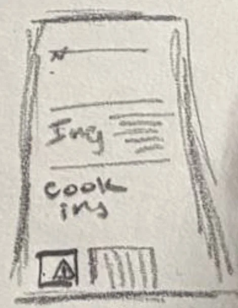
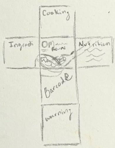
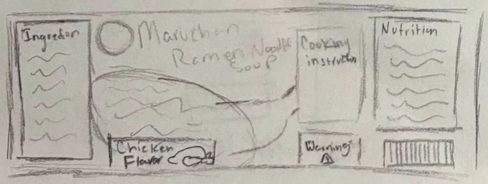
Sketchs
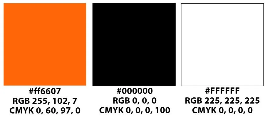
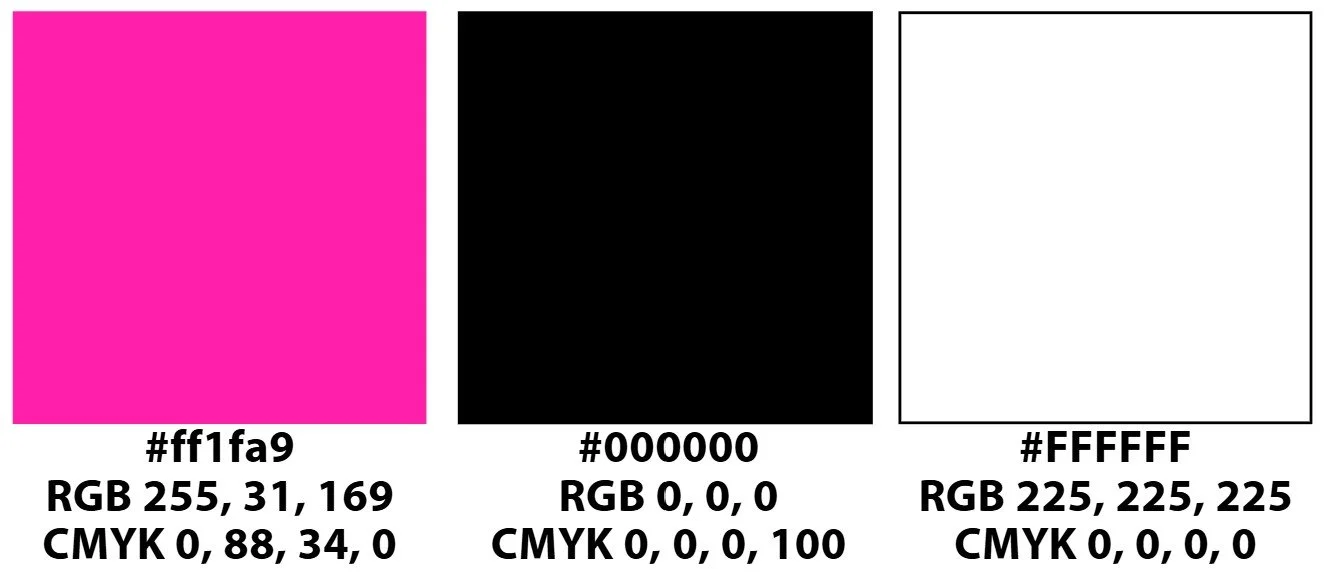
Color
The main colors used are orange, pink, and red; each drawn from the original ramen packaging but slightly brightend to give them a fresher feel. The bolder tones help the packaging stand out on shelves while still feeling connected to the nostalgic roots of instant ramen.

Typography
I chose Knewave for the heading because its bold, hand-lettered style adds personality and captures the playful energy of the packaging. Rowdies works for the subheadings with its chunky, but clean look that still feels friendly. Myriad Condensed keeps the body text clean and legible, especially in tight spaces like the back of the package. Together, the fonts create a balance of expressiveness and clarity.

Digitals
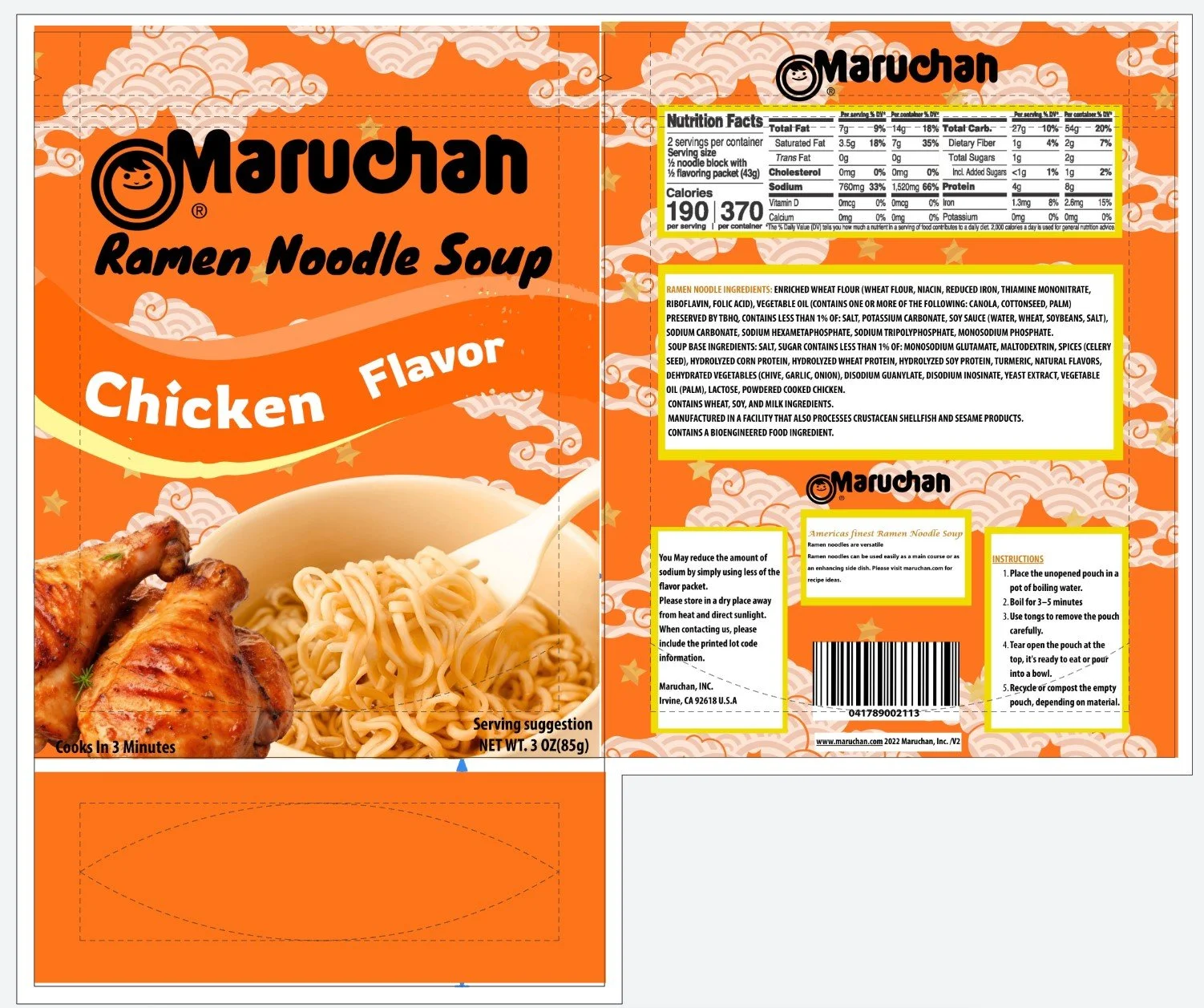
Front
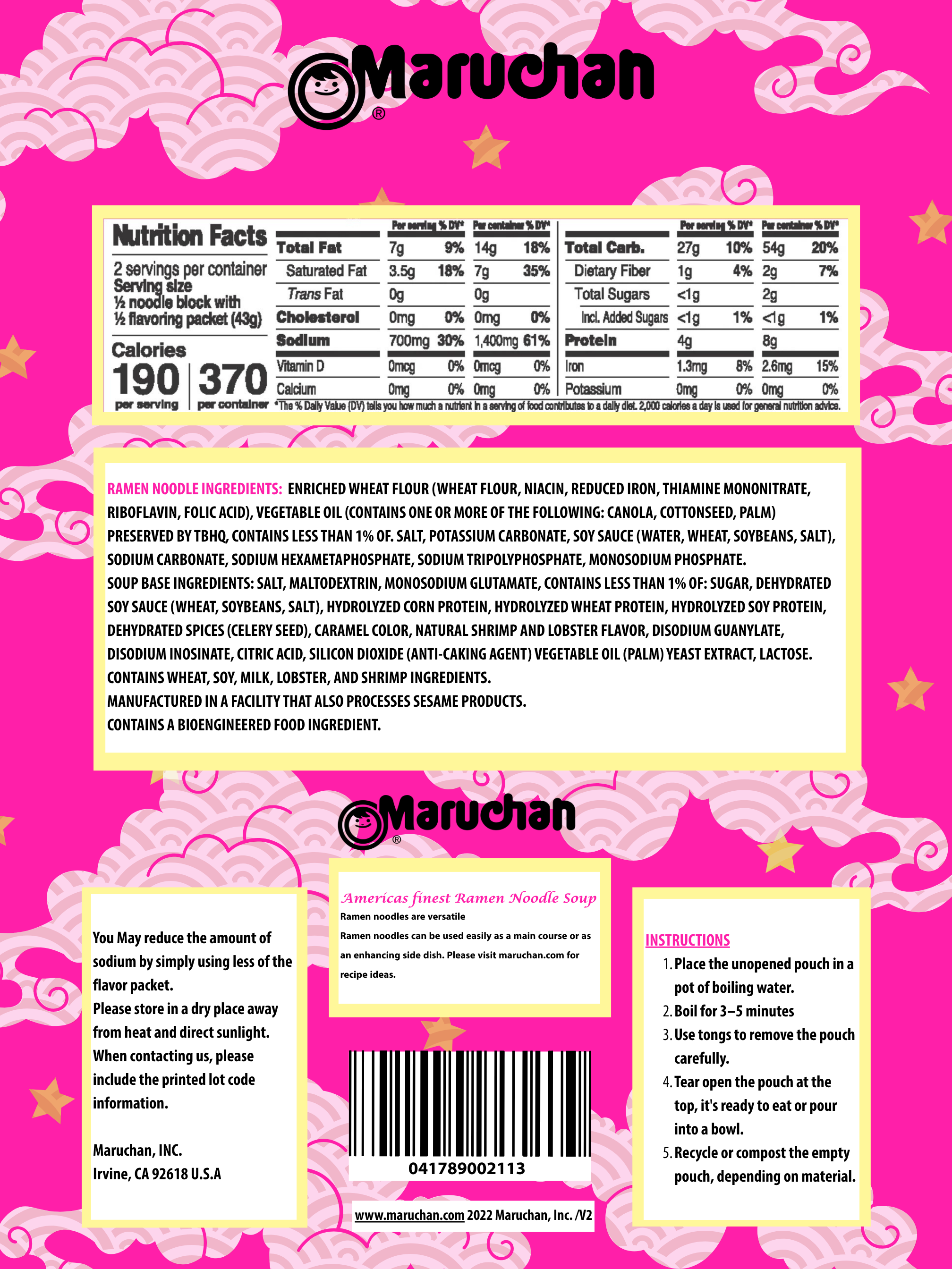
Back
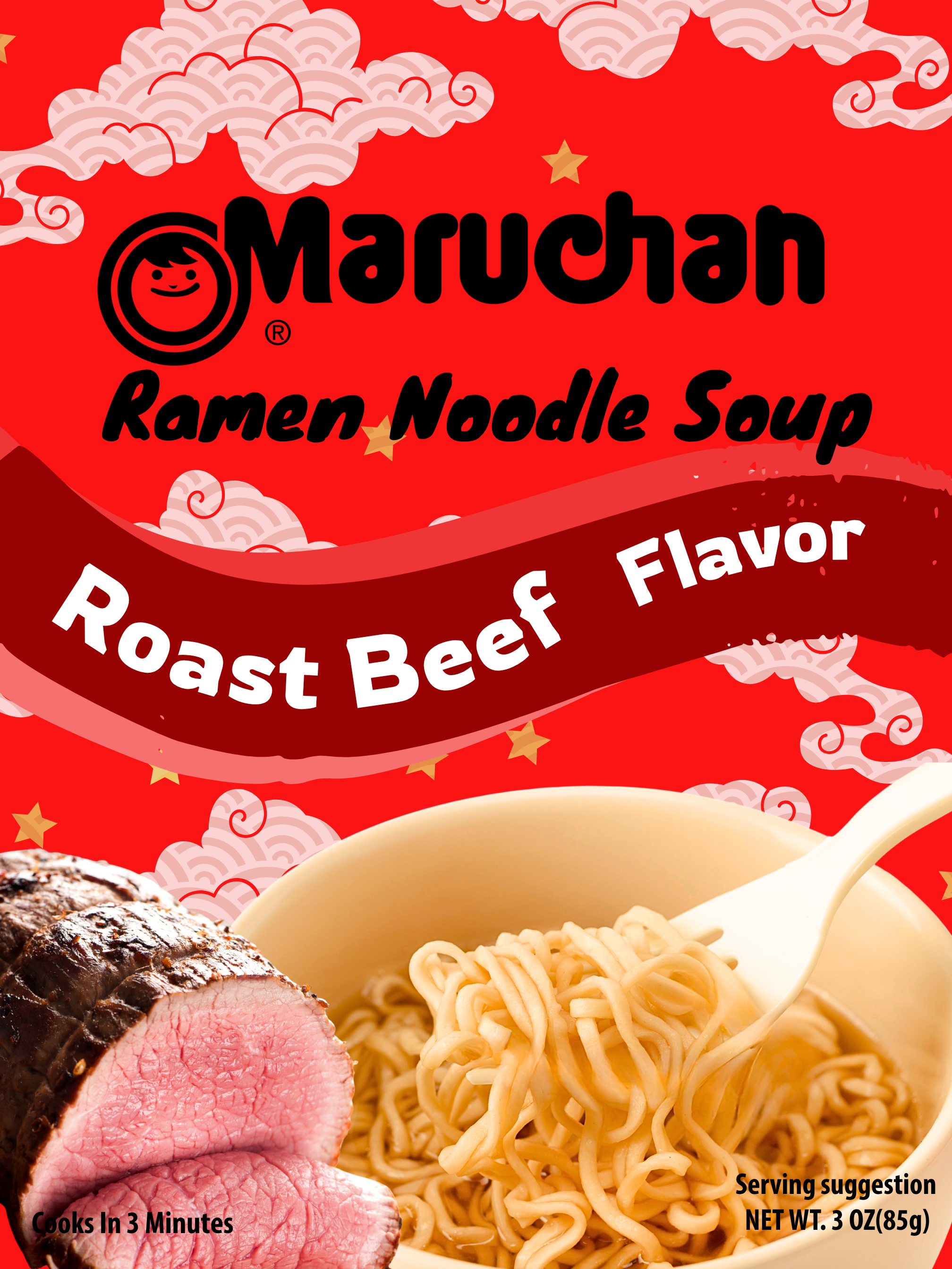
Front

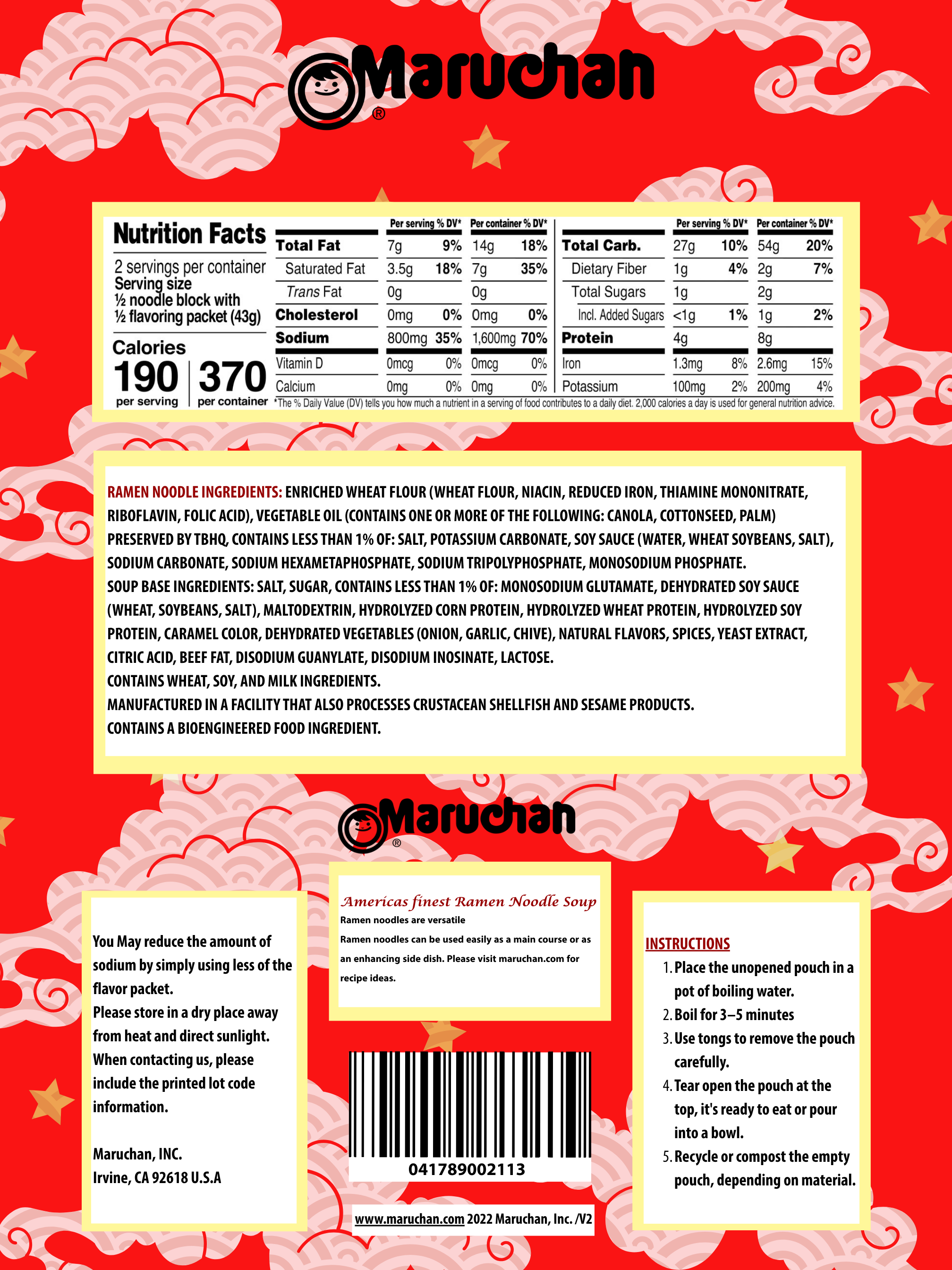
Back
Front
Back
Delines
Evnironmental Contact